Flophouze Rebrand
Brand Brief
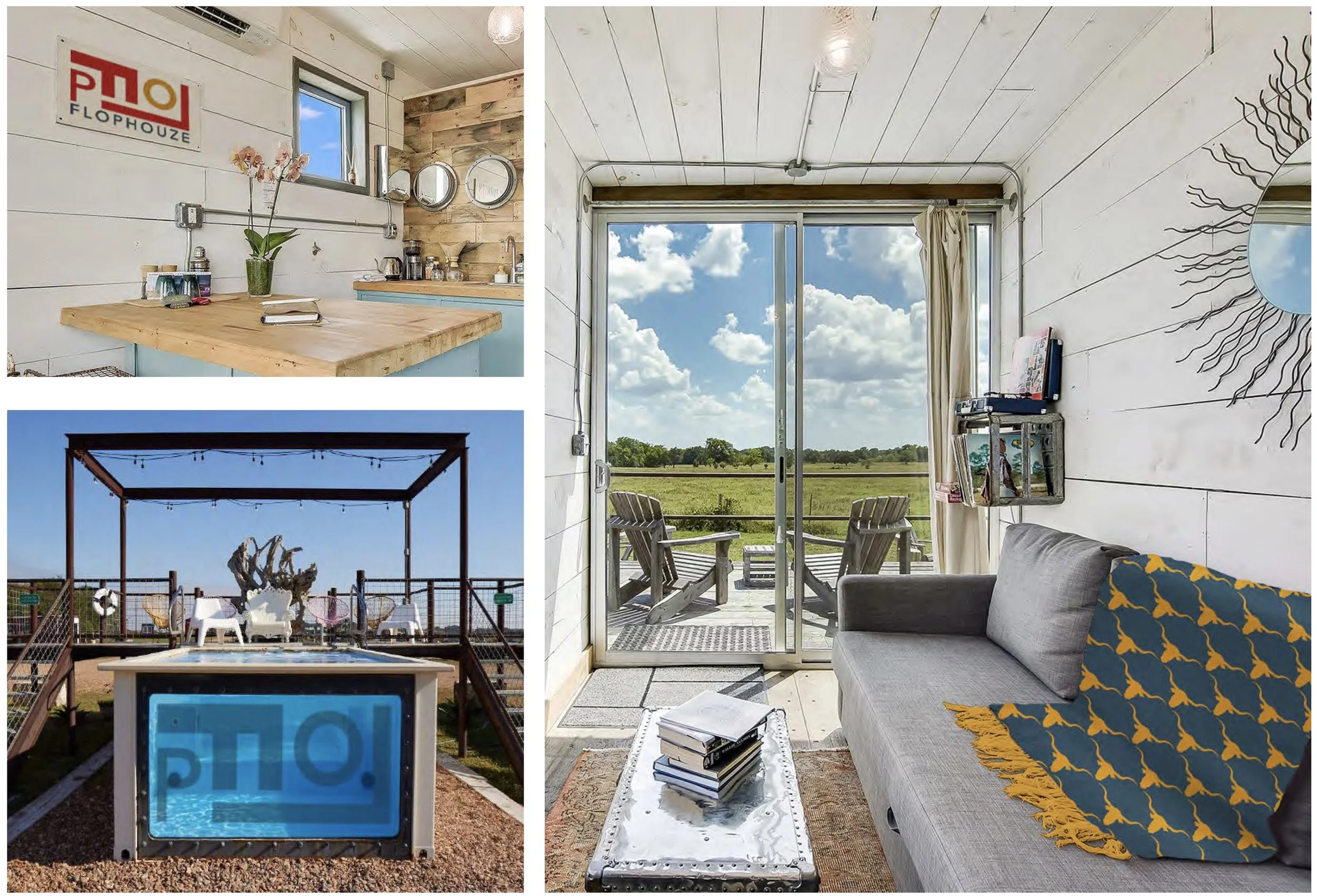
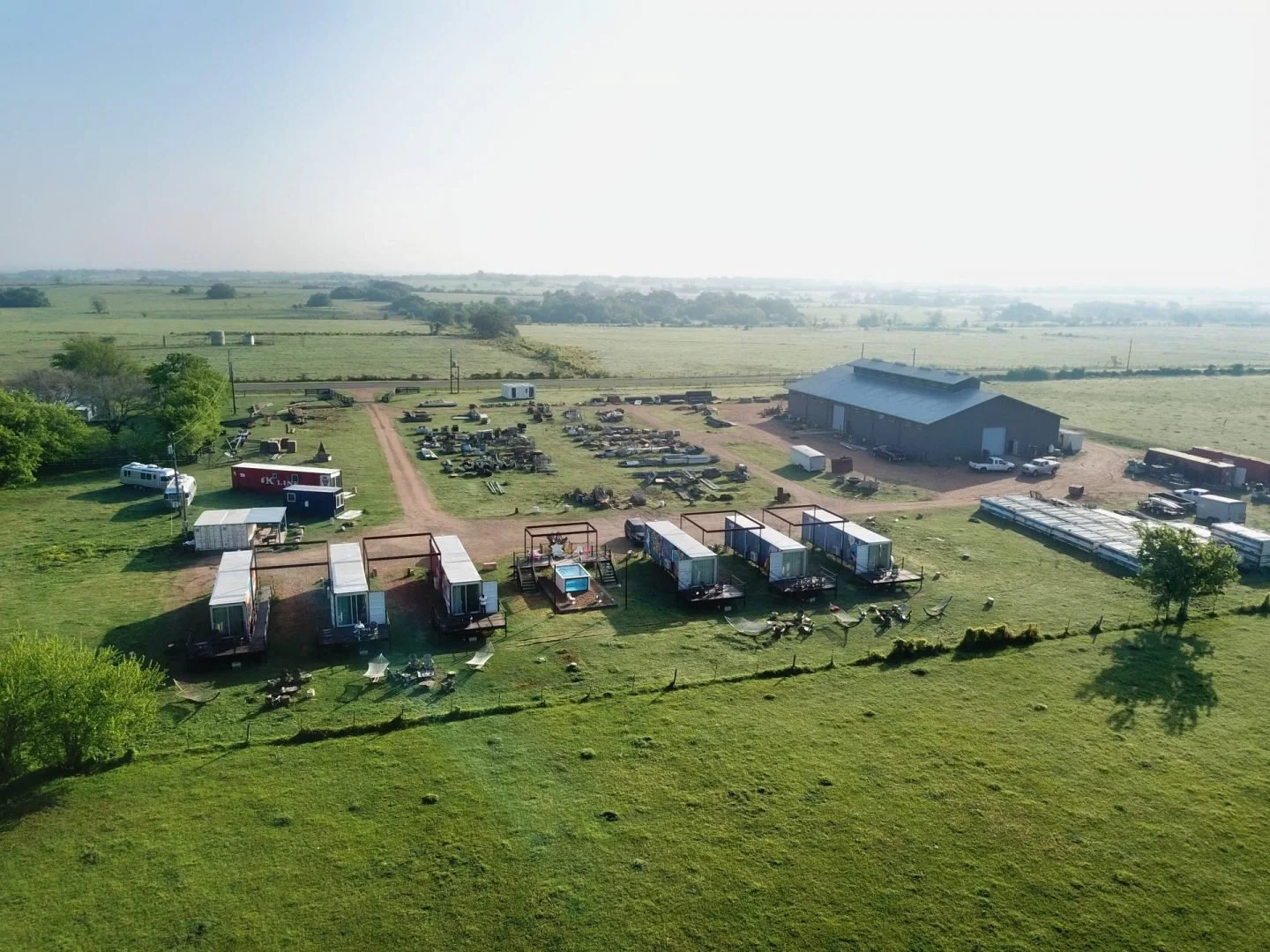
Description: Located amid a working ranch in Round Top Texas, Flophouze is an eco-chic, tiny home style, shipping container resort and event space. There are 6 remodeled shipping containers for guests to choose from, each with its own hammock, fire pit, and record player. A stay at Flophouze includes more than a relaxing night or two in a funky shipping container tiny home though. Onsite there is also a swimming pool made from a remodeled shipping container, as well as a communal style dining hall and event space.
Story: For over 20 years, Matt White has been salvaging antiques, artifacts, and left over building materials with his company Recycling The Past. RTP is one of the top salvaging companies in with clients such as Nordstrom, Anthropologie, and Timmy Hilfiger.
In 2018, Matt started Flophouze as the sister company to RTP. As mentioned, Flophouze has 6 shipping containers, but there are plans to expand. Each shipping container interior space has been created rom 100% up-cycled and salvaged materials.
Reason to Rebrand: Reason to Rebrand Flophouze was born out of Matt White’s self claimed unconscious need to up-cycle, and to find value in something where others may not. This passion seems very tangible at the actual hotel, and also shines through in the tagline, The Hotel With Soul. However, if that passion does not come through visually online, or in their social media, not too many people will choose Flophouze as a destination point. The first reason to rebrand is to connect the heart and soul of the actual hotel with the online presence to bring more guests to the resort.
A second reason to rebrand is to also to bring awareness to Flophouze, as it could play a huge role in the eco-conscious tiny home community. After researching other shipping container hotels, I found there was only handful within the US. While the competitors do claim their shipping containers have been remodeled with “recycled materials”, none of the competitors include a communal space on their property. A big part of the tiny home, and shipping container home space is the community that it brings together.
Brandscapes
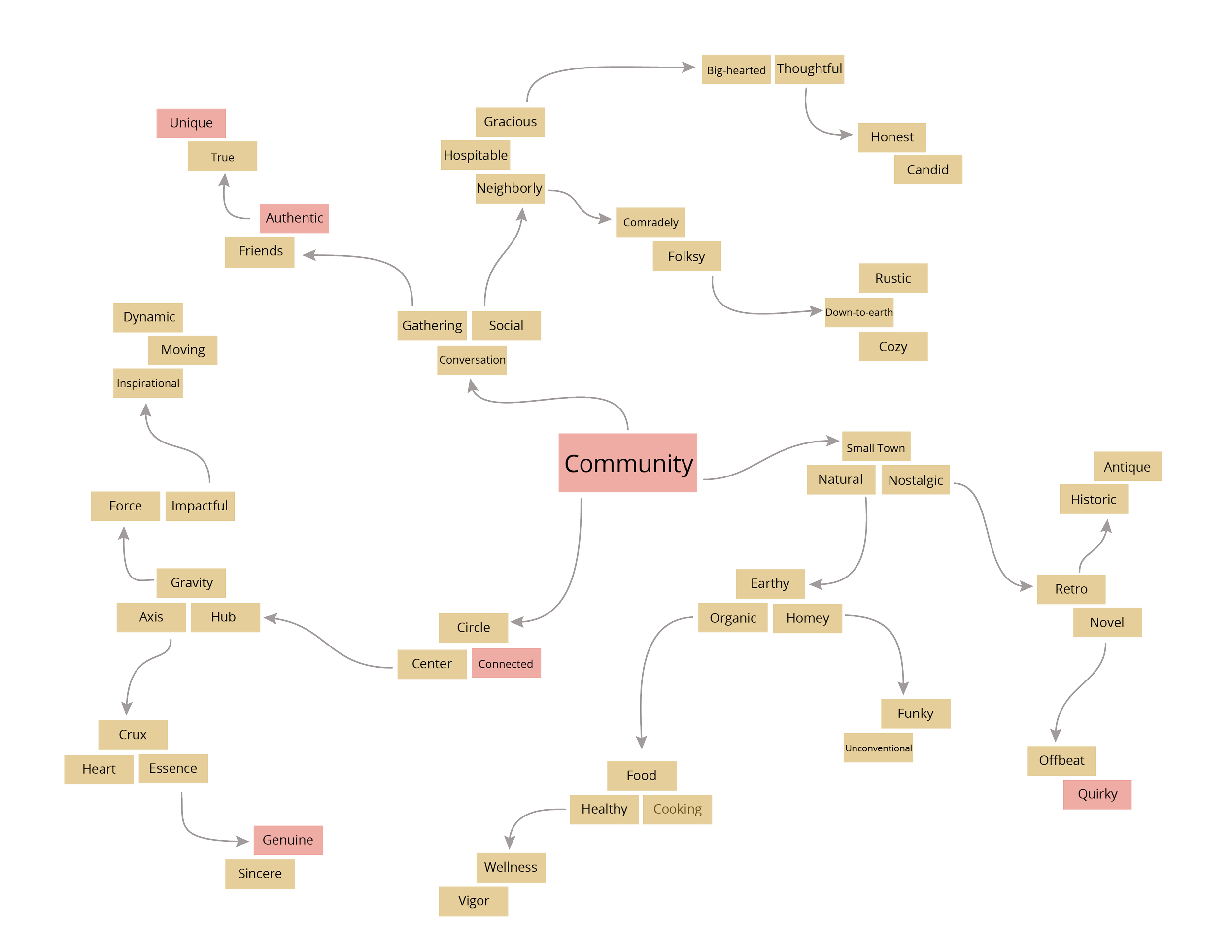
Mind Map Development: The first mind map ideation was based on initial research about the brand. From that initial research, the first 3 word I felt described the brand best were sustainability, cozy, and community.
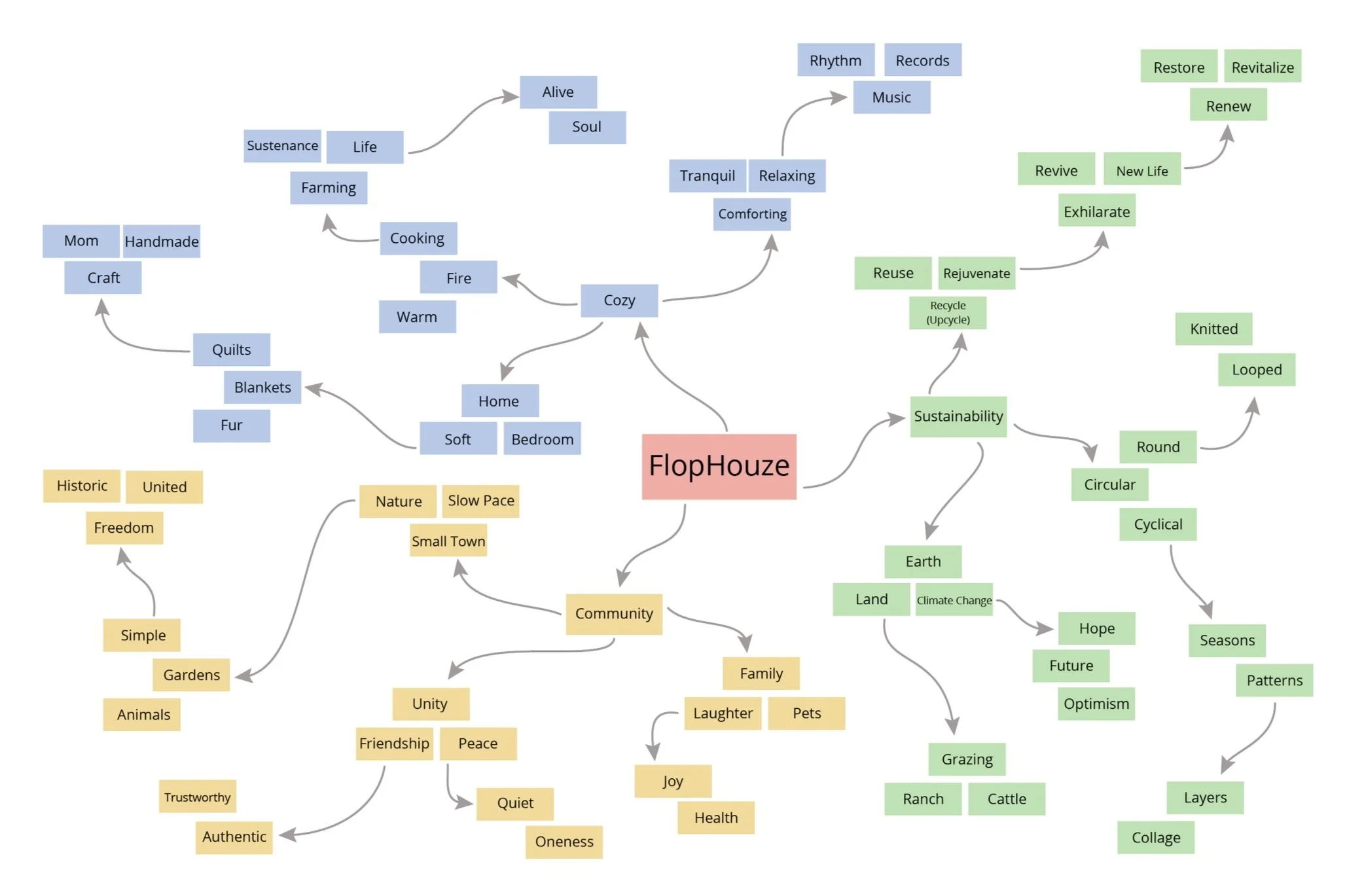
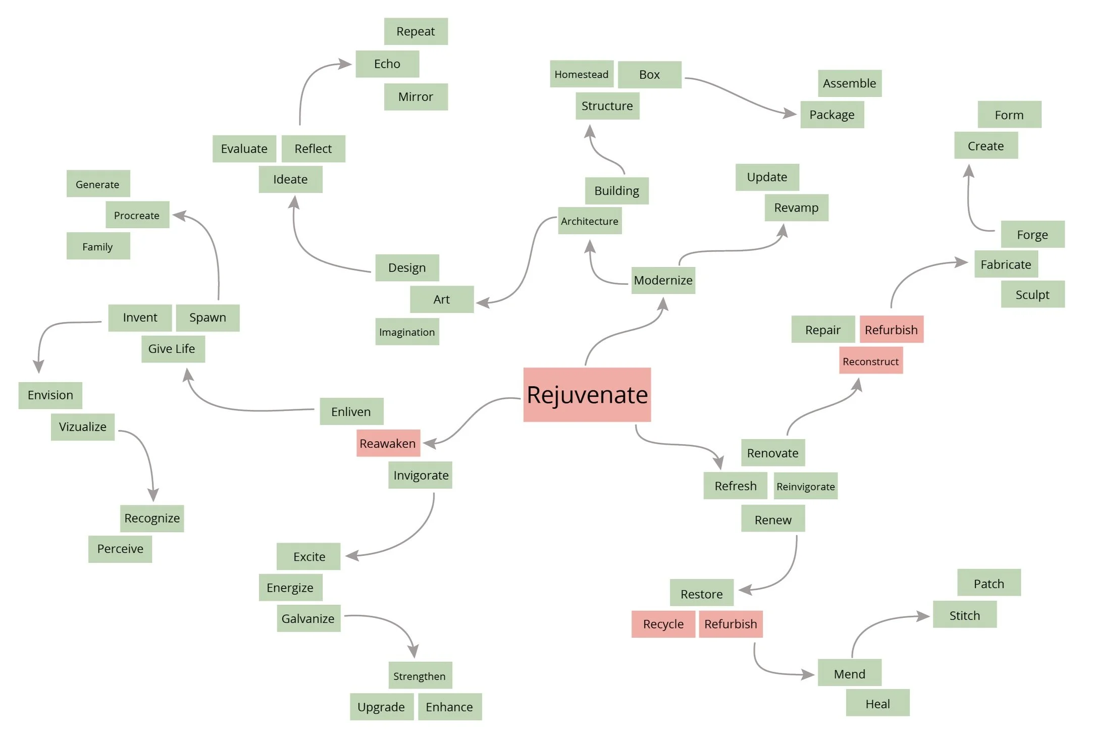
Refined Mind Map and Mood Board: rejuvenate, with supporting words restore, reconstruct, refurbish, reawaken
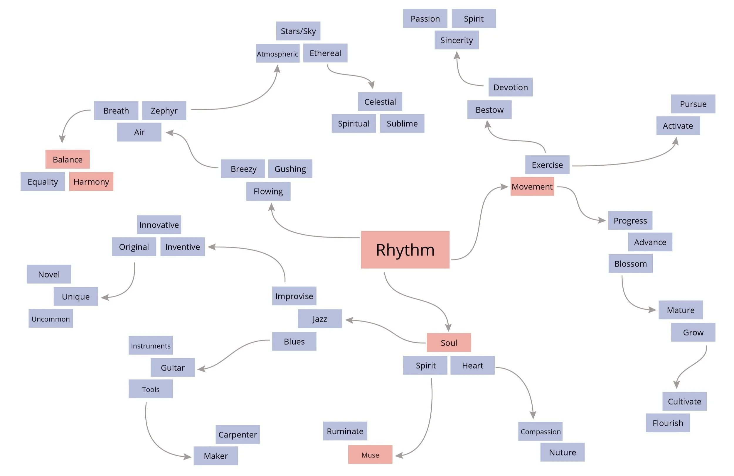
Refined Mind Map and Mood Board: rhythm, with supporting words soul, balance, movement, harmoney, muse
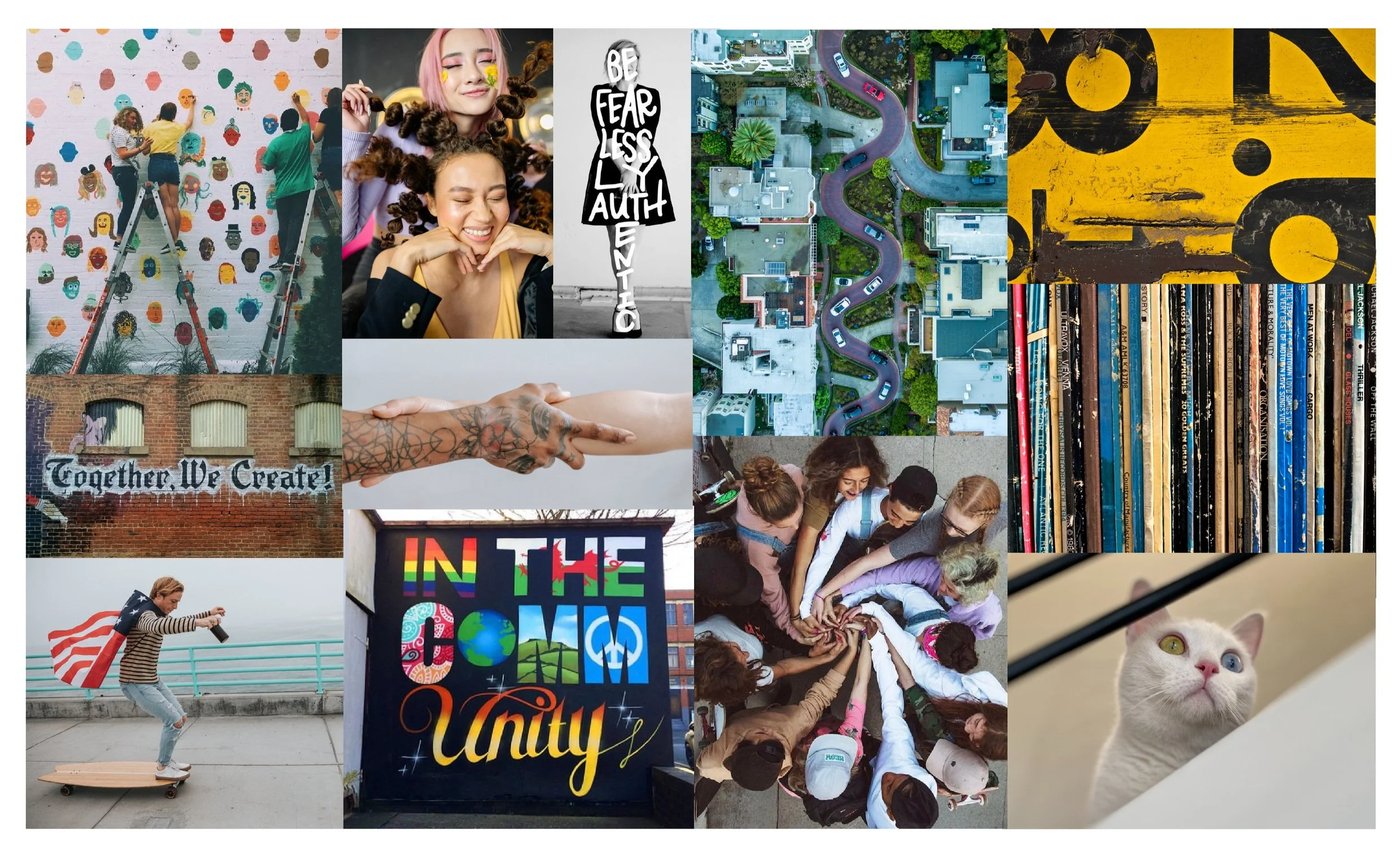
Refined Mind Map and Mood Board: community, with supporting words connected, genuine, authentic, unique, quirky
Brand Design
Logo Design
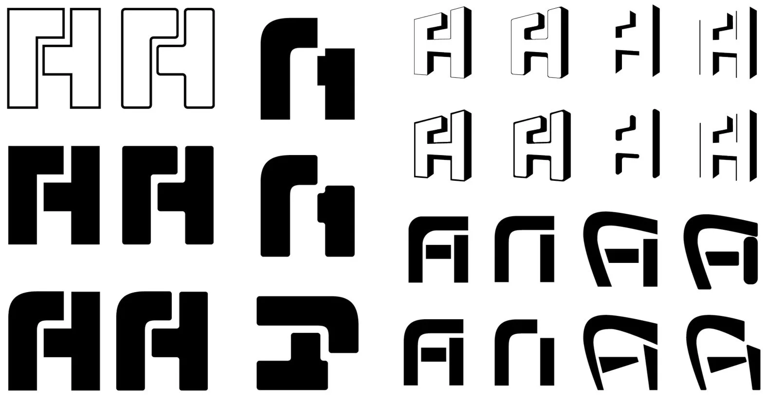
In the initial sketch phase, I explored using the letters F and H in a handful of configuration, as well as the recycling symbol, and the shape of the shipping container.
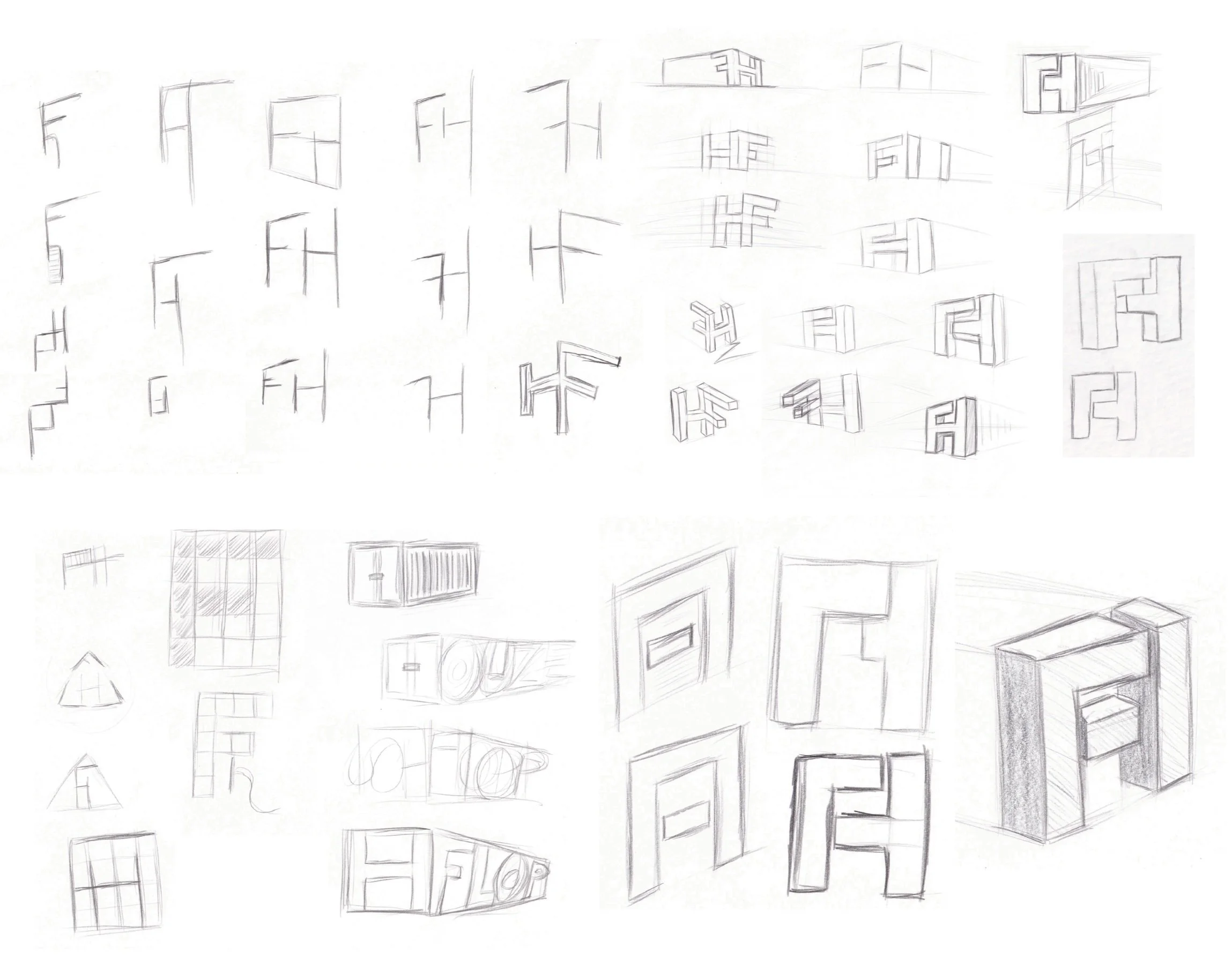
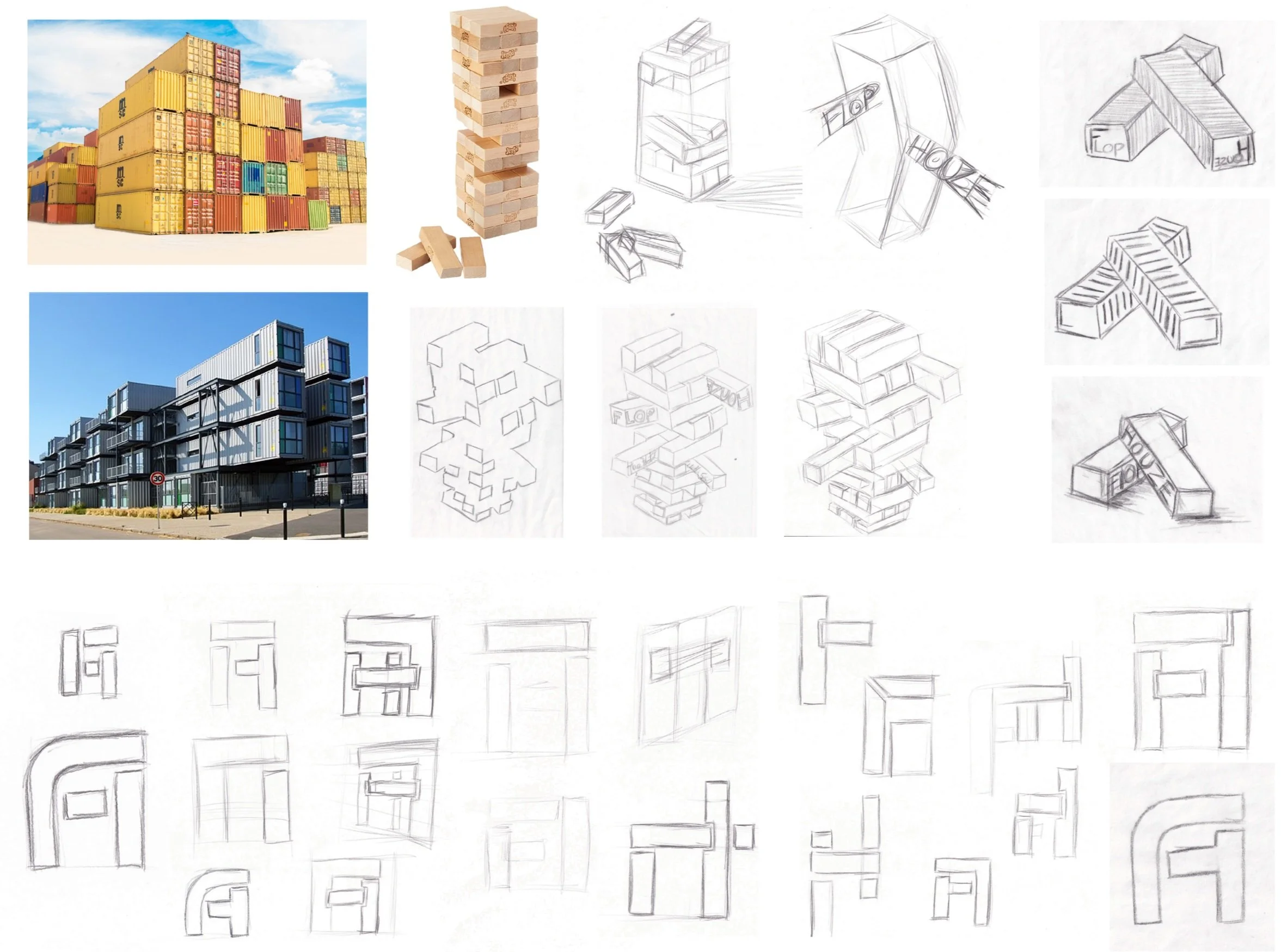
After not coming up with anything worth moving forward with in the initial sketch phase, I decided to re-look at the main feature of Flophouze, the shipping containers. I realized their container shape looks like building blocks. I also re-looked at images of Flophouze interiors on their website and discovered each container has a set of board games for visitors to play. One board game stood out, Jenga - which is a game made of building blocks with a similar shape to shipping containers. To the right are sketches based on Jenga. Below are FH sketches broke into building block shapes.
I was debating between the FH configuration concept and the Jenga block concenter, so I created a round of digital sketch refinements based on a the FH analog sketches to see how this concept could look moving forward.
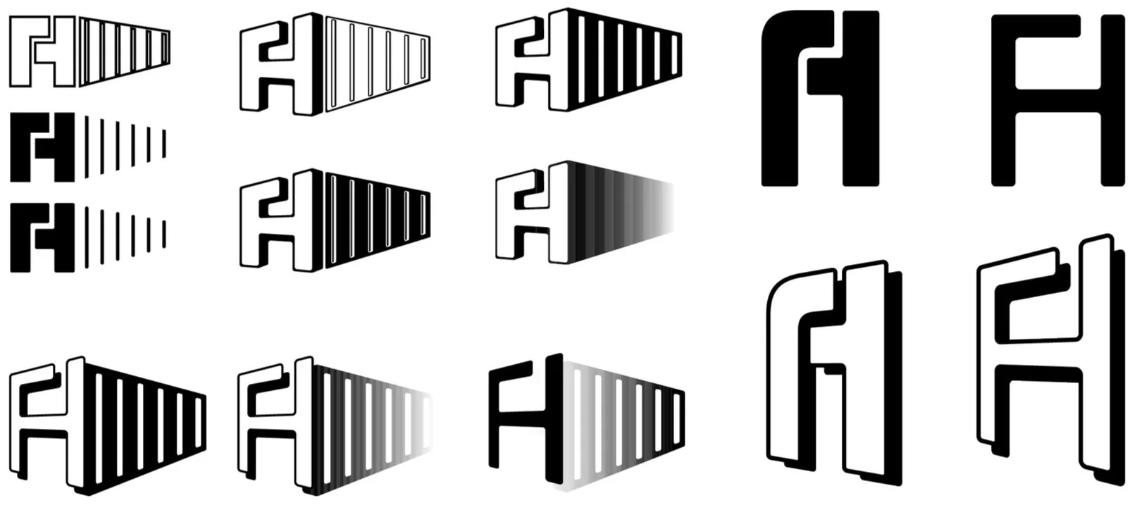
After still not being satisfied with the digital FH logo ideas, I decided to go out and buy the Jenga game, to explore the building block concept further.
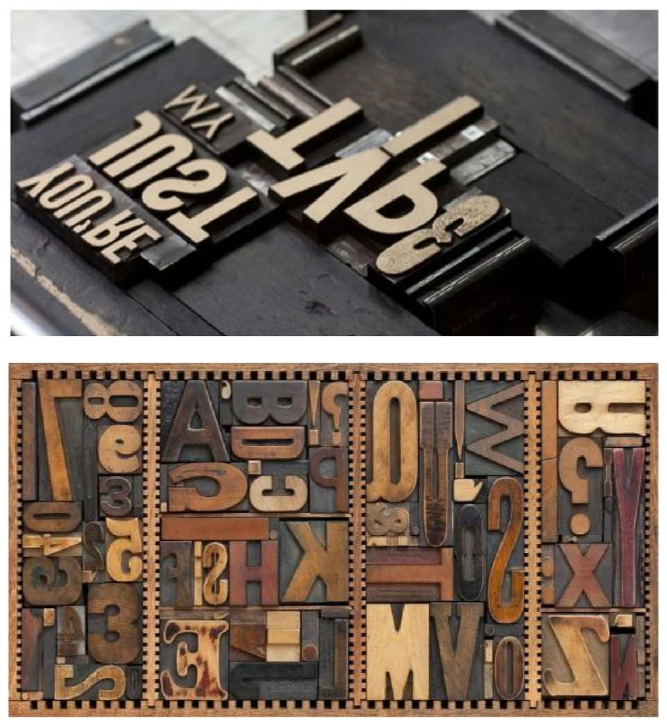
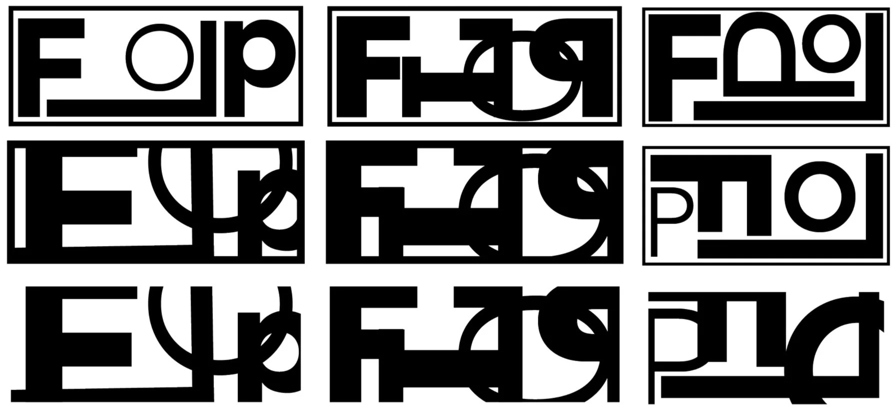
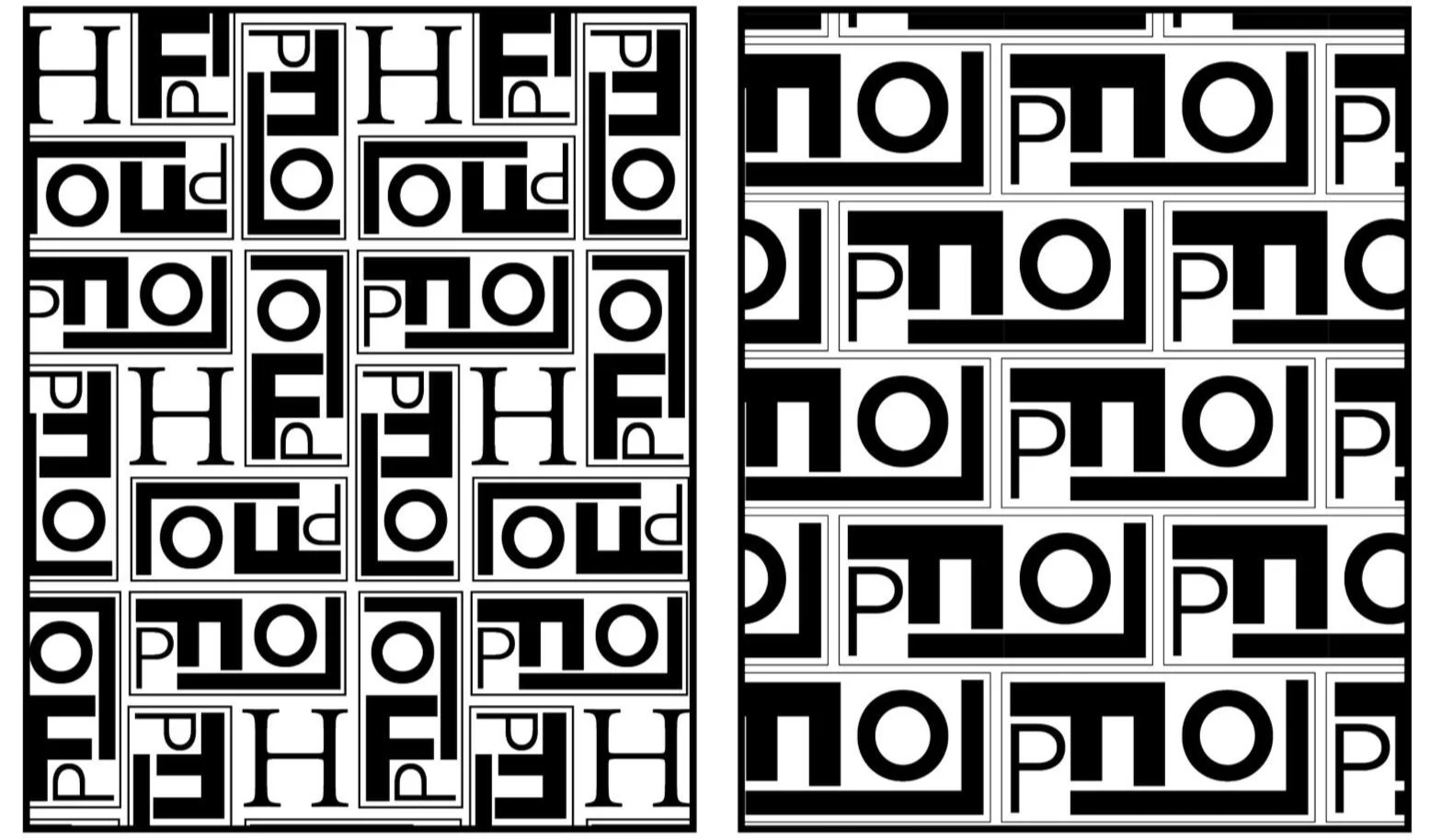
While building with and studying the Jenga block, I was reminded of the shape of old letterpress trays and letters. I decided to explore using a variety of fonts in varying scale, weight, and orientation.
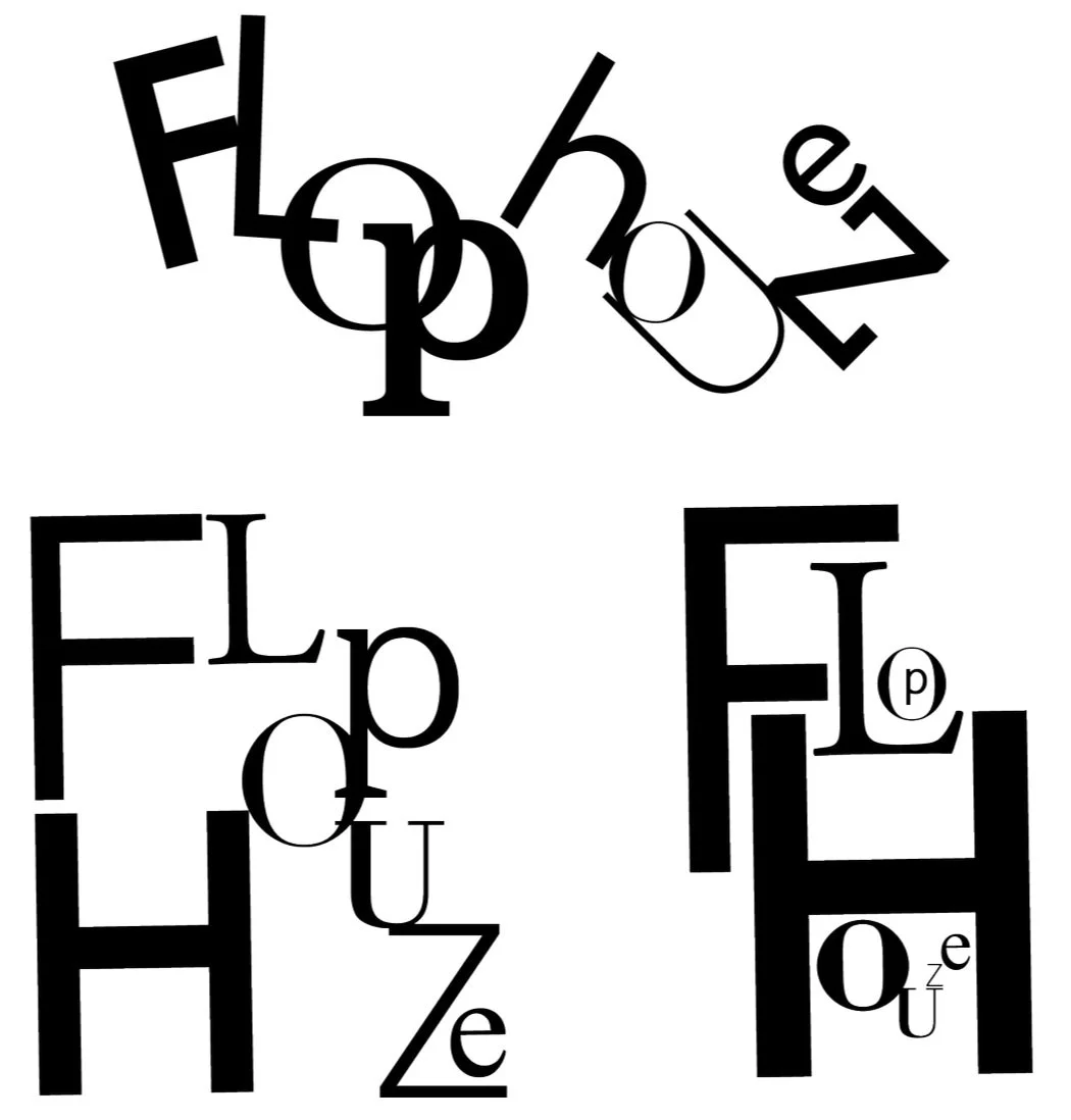
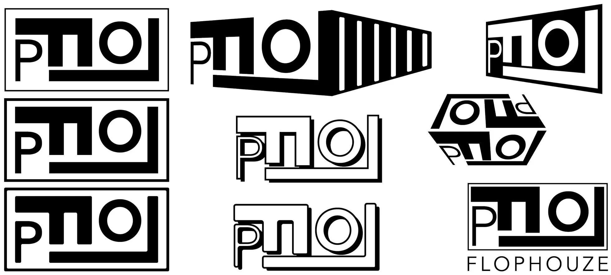
Using the rectangle as a container, I then explored various lockup of F L O P combining both serif and san serif fonts.
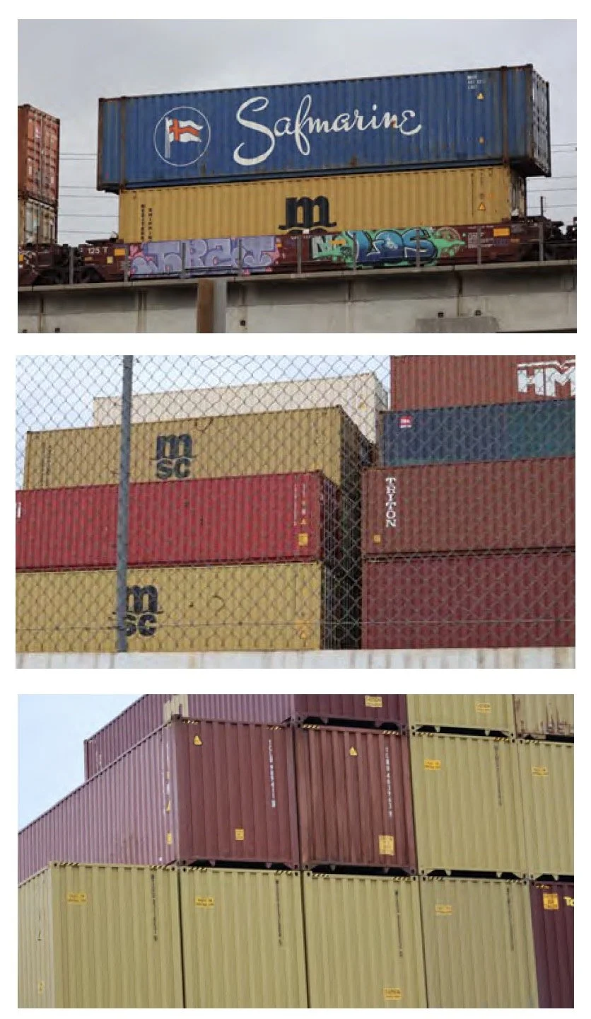
I tested a handful of color palettes. After taking a drive to the Long Beach port to study shipping containers in real life, I landed on my final color palette. The final color pallette not only matches the colors of most shipping containers at the port, but also the colors of the shipping containers at Flophouze.
I knew I wanted a logo that could also be put into a repeat, so I also explored creating patterns using the rectangle “block” logo ideations before finalizing.
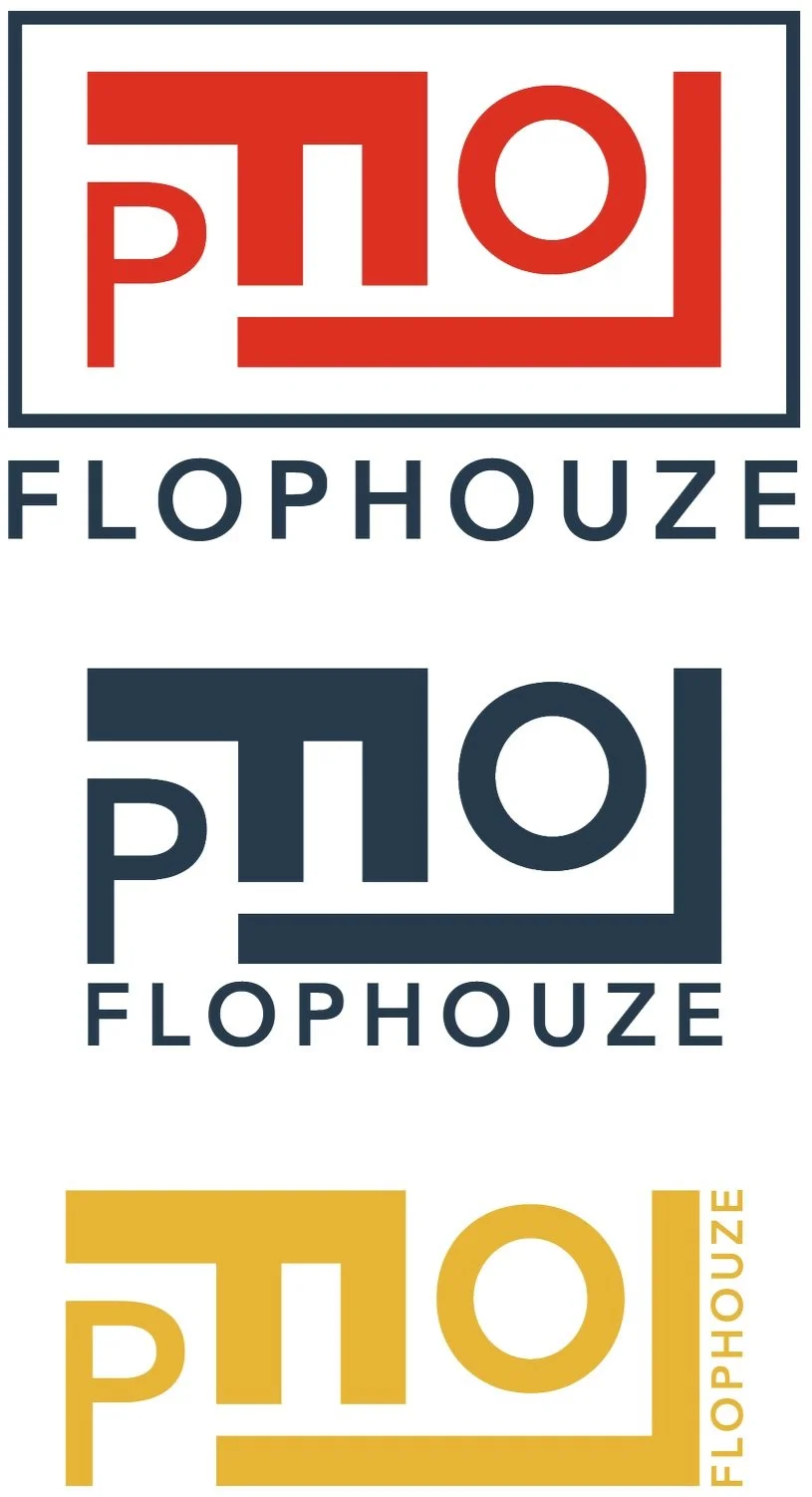
Final Logo
Final Logo + Wordmark
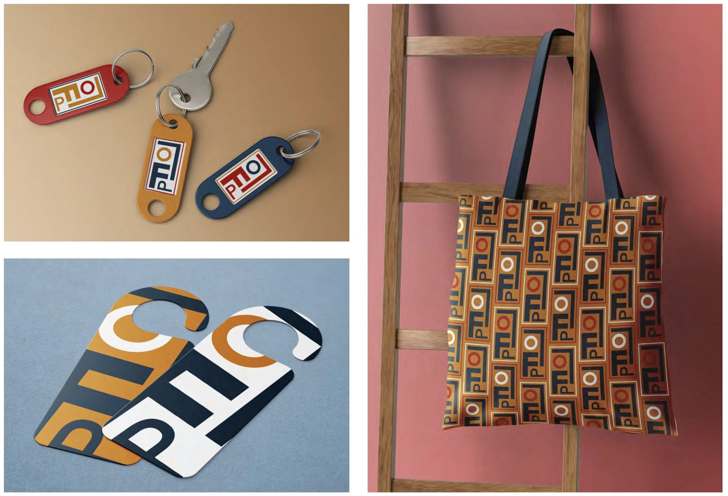
Graphic Elements
A handful of postcard ideations utilitzing the FLOP logo, funky little outposts, and a peace sign, which is found on each interior front door of the shipping containers at Flophouze.
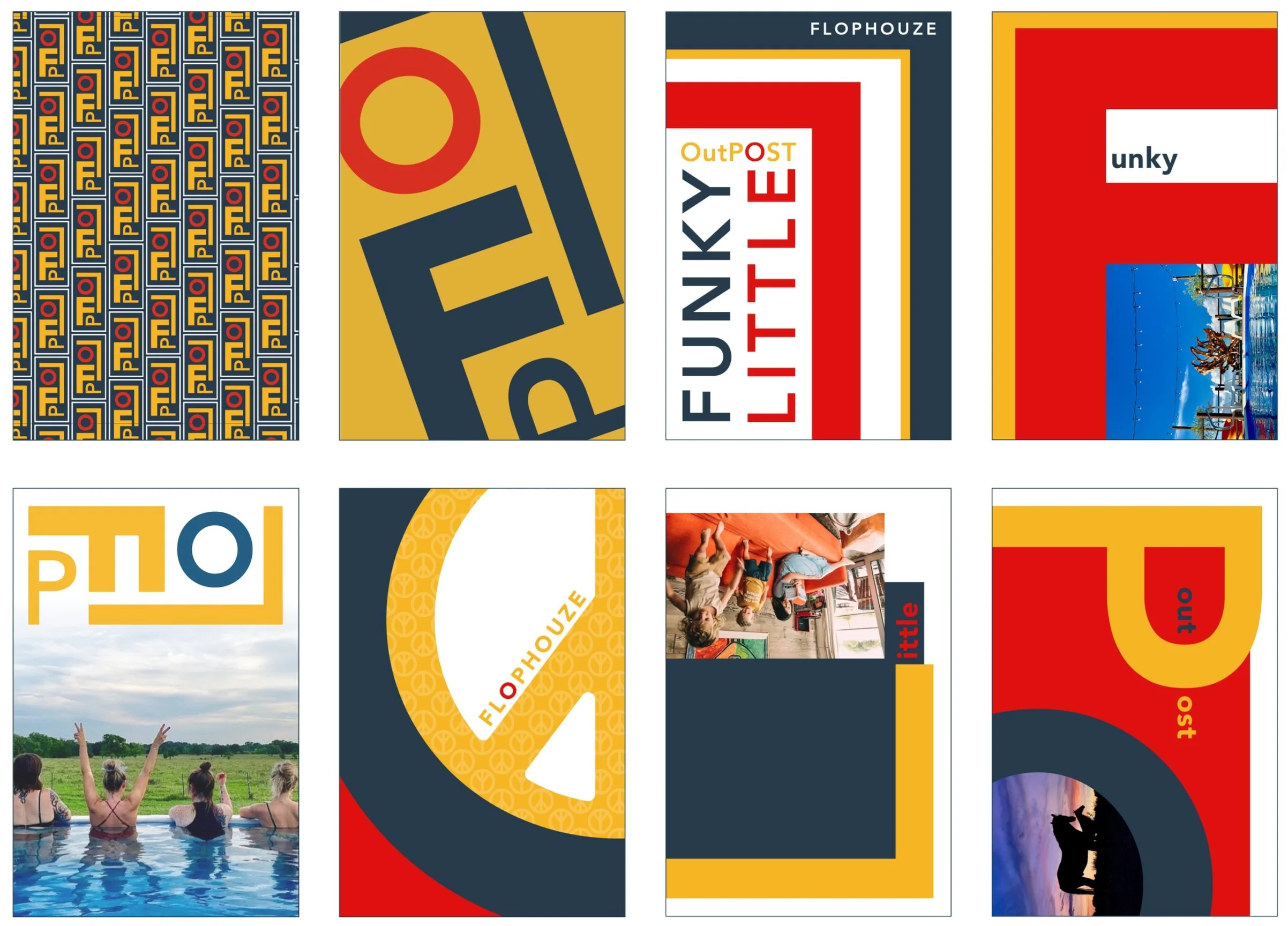
Final Postcard Designs


Brand Narrative
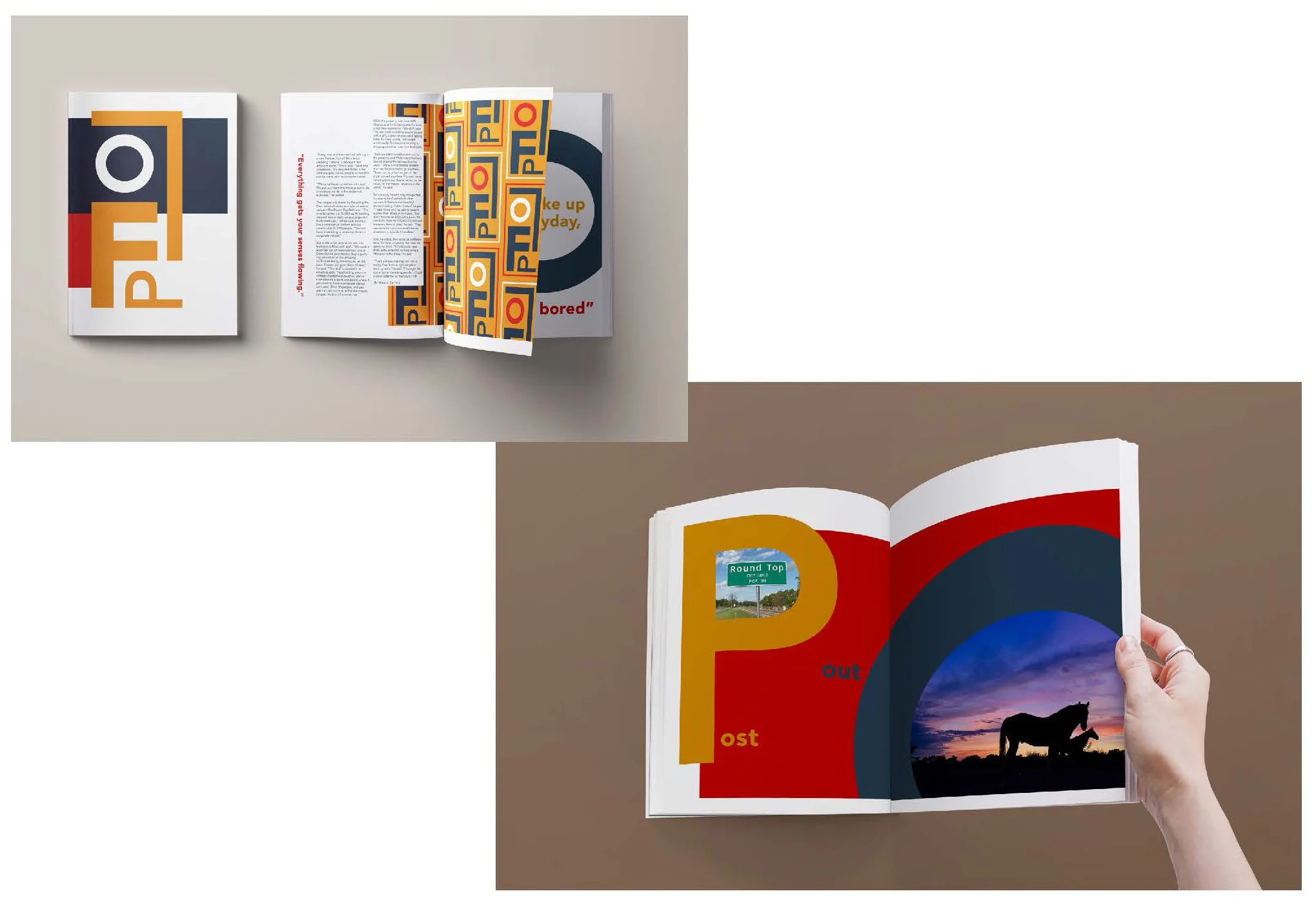
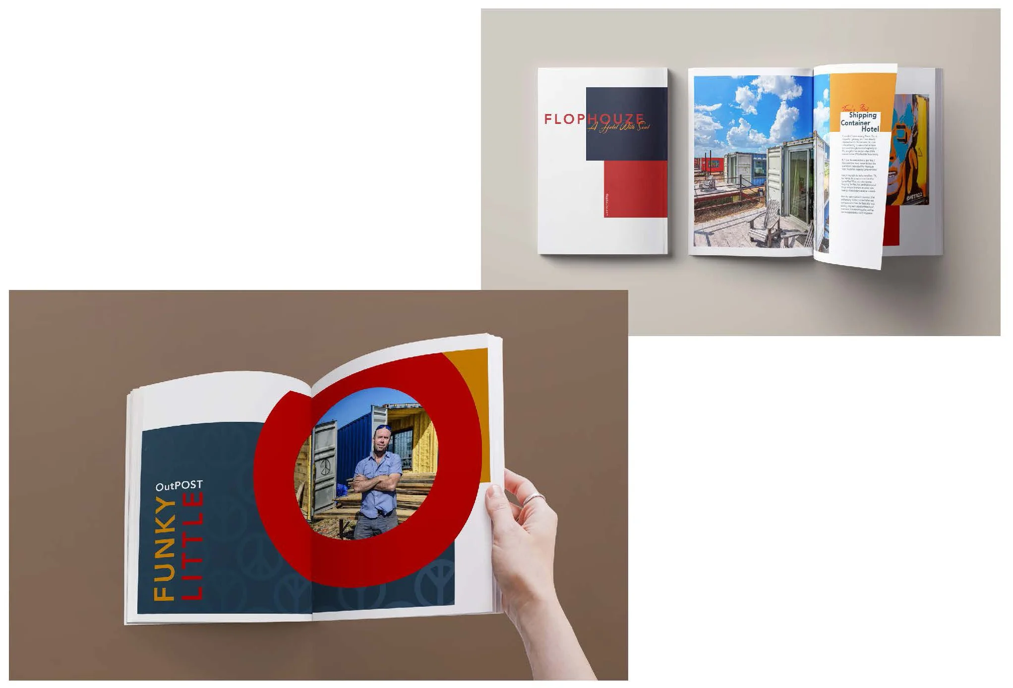
Lookbook
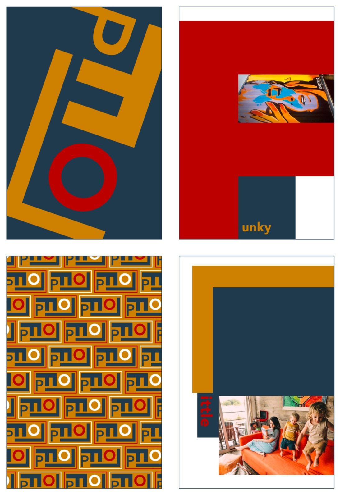
For the lookbook development, I began experimenting with type scale and using F, L, O, and P at a large scale to create the compositions for each spread.


Lookbook Final Design
Brand Implementation
Media - App Design
For the app research, I began researching other unconventional hotel websites for reference to start. I quickly discovered that I wanted to build an app however, and that this app should include more than just the ability to book at stay at Flophouze. Flophouze is not only be a unique hotel to stay at, but also potentially a community hub for the shipping container and tiny home community, antique seekers, and up-cycle makers. With that in mind, I also researched apps that focused on community.
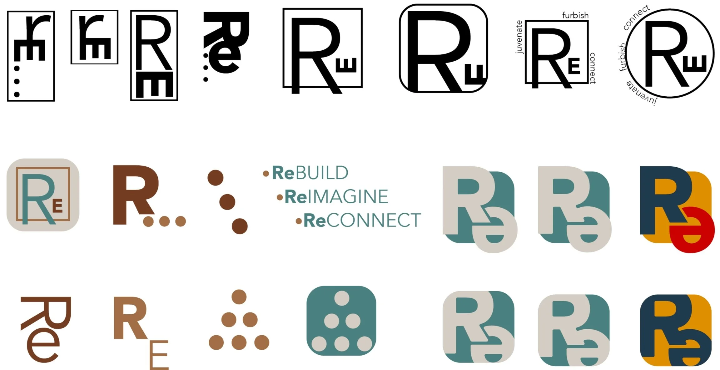
Because app design needed to have a community focus, I explored options for the app name other than Flophouze. After re-looking through my design process work, I remembered that one pf my mind maps included several words that started with RE. This was a concept that I briefly explored for the Flophouze rebrand, but decided overall it wasn’t the direction I wanted to go. For the community app, it seemed to work well.
REbuild: Focuses on the up-cycling/refurbishing aspect of the app.
REimagine: Aligns with both the up-cycling of objects, and the larger concept of re-imaging how housing can be build now and in the future.
REconnect: Speaks to the community building purpose of the app.
Site map: Included both the social media community section, as well as the section with info about Flophouze and away to too book at stay.
Logo: Two options, RE text and the connected 3 dots.
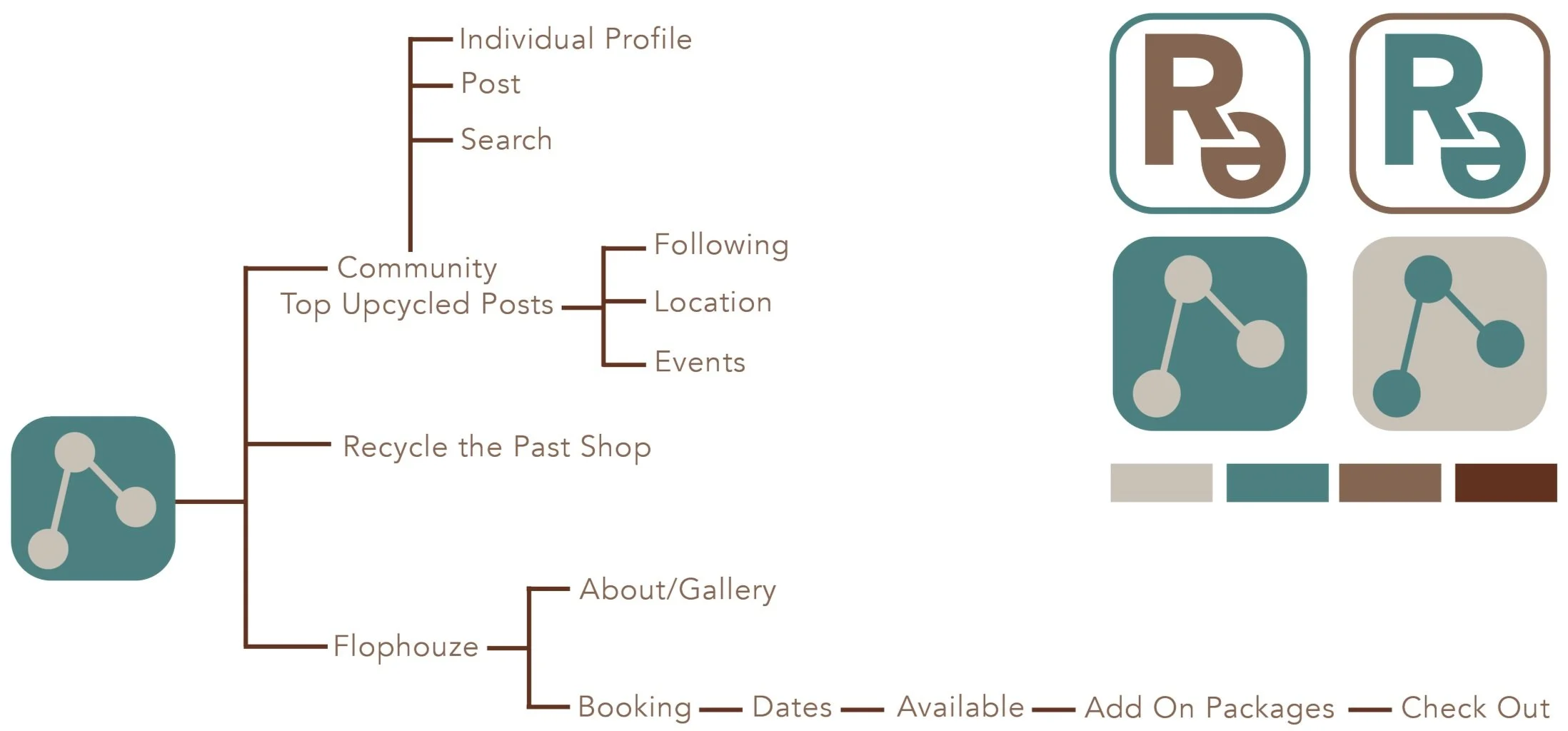
The initial app wireframing ideation including an opening screen, social media feed, personal profile, shop, and blog.
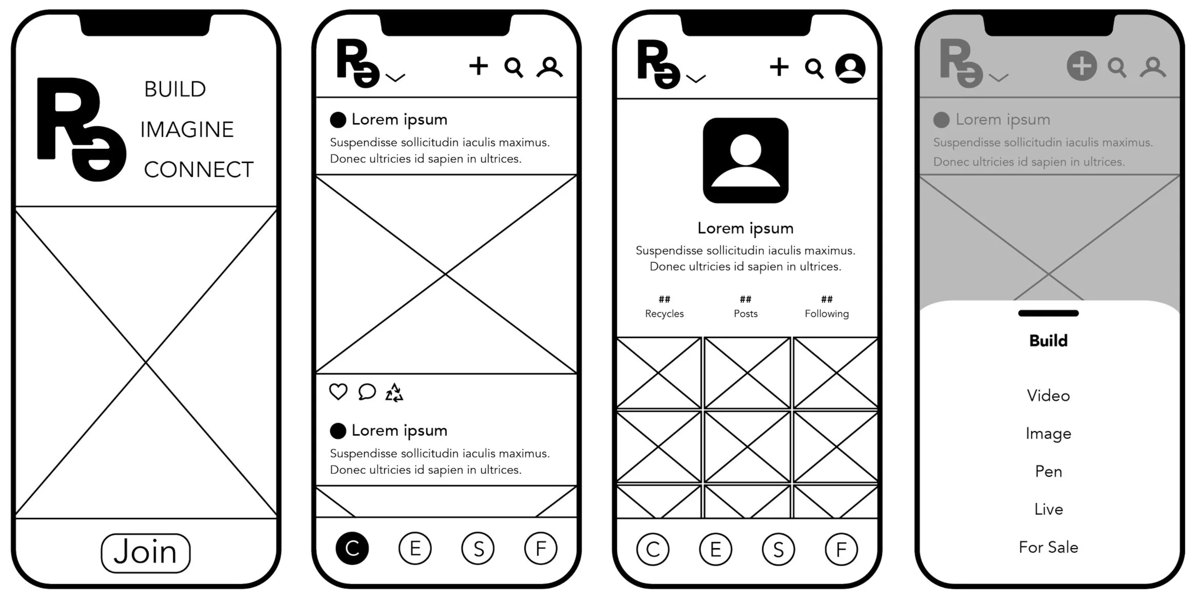
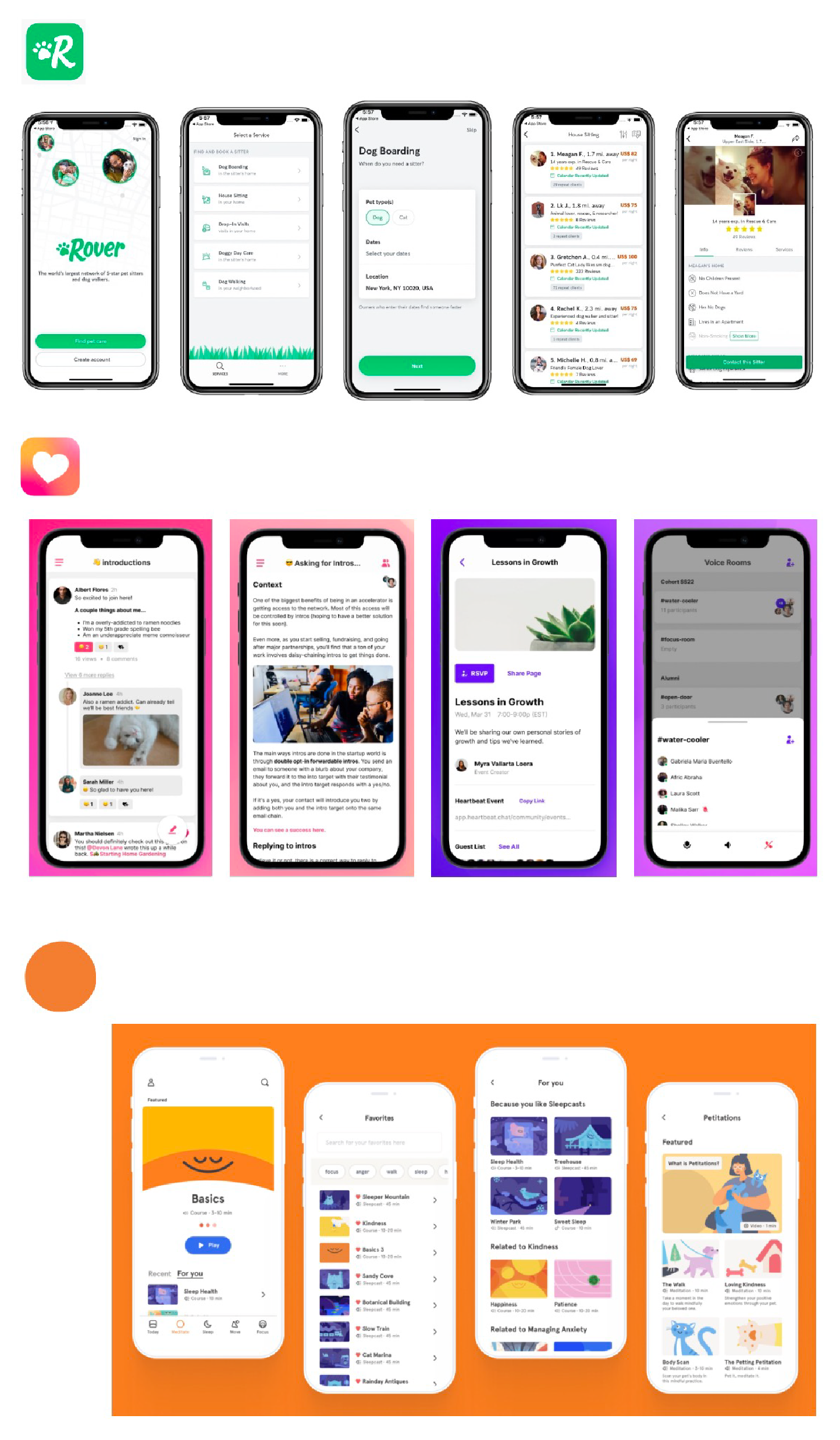
Final App Design: Re
When the user opens the app for the first time, they will see the “Join the Community” screen. To enter, the user will then click the “Join the Community” button to begin.

In order to access the app, the user will need to create an account with a name and email. A confirmation email will be sent to the user to confirm the email address, then the user will be able to sign in.
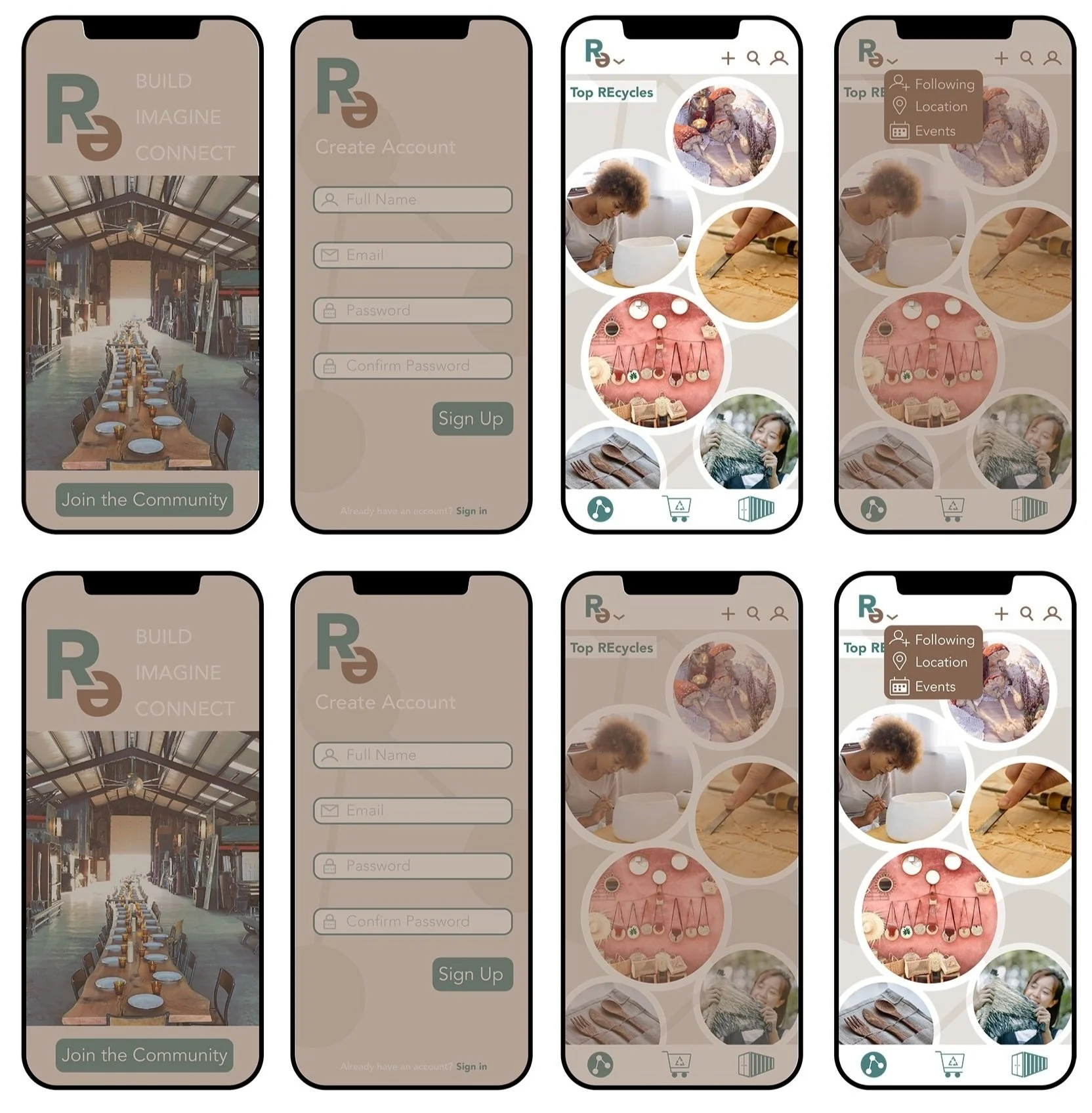
Once the user signs into the app, their feed will be displayed. The default feed will be the “Top REcycles”. When a user explores a post, they have options at the end of the post to like, comment, and REcycle. The more REcycles a post gets, the higher it will show up on the Top REcycles feed.
Users also have the option of filtering posts by who they follow, the location of posts, and only look at a feed of upcoming events.
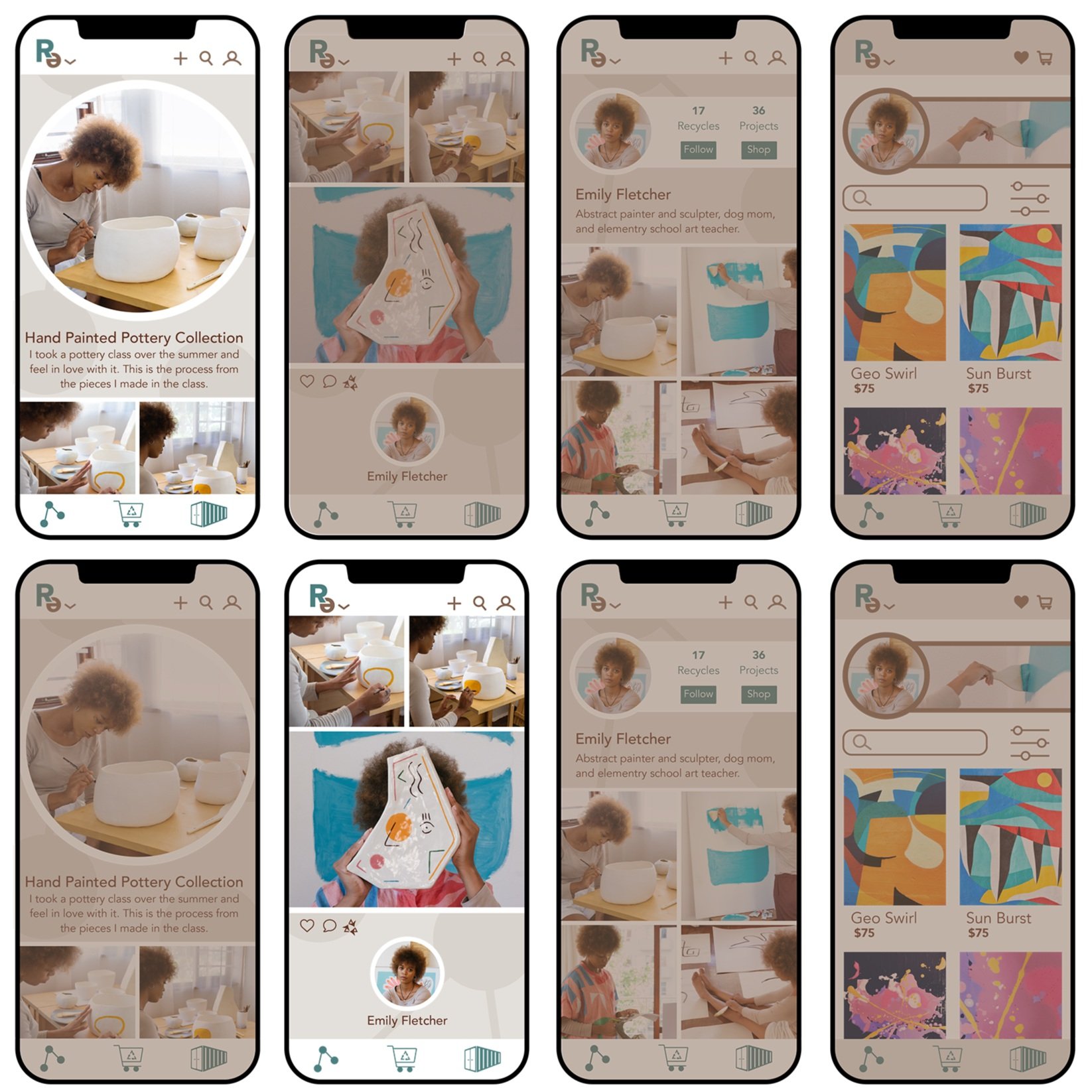
After a user clicks on a post from the main page, they are brought to the full page of that post. A post can include process, final products, an event, or anything else users would like to post about that is centered around recycling, refurbishing, art, crafts, gardening, times home building, etc.
Photos and information about the post are seen first, with the user who posted at the end. This is because the focus of this community app is not about follows, but rather about the ideas and products people are coming up with and creating.
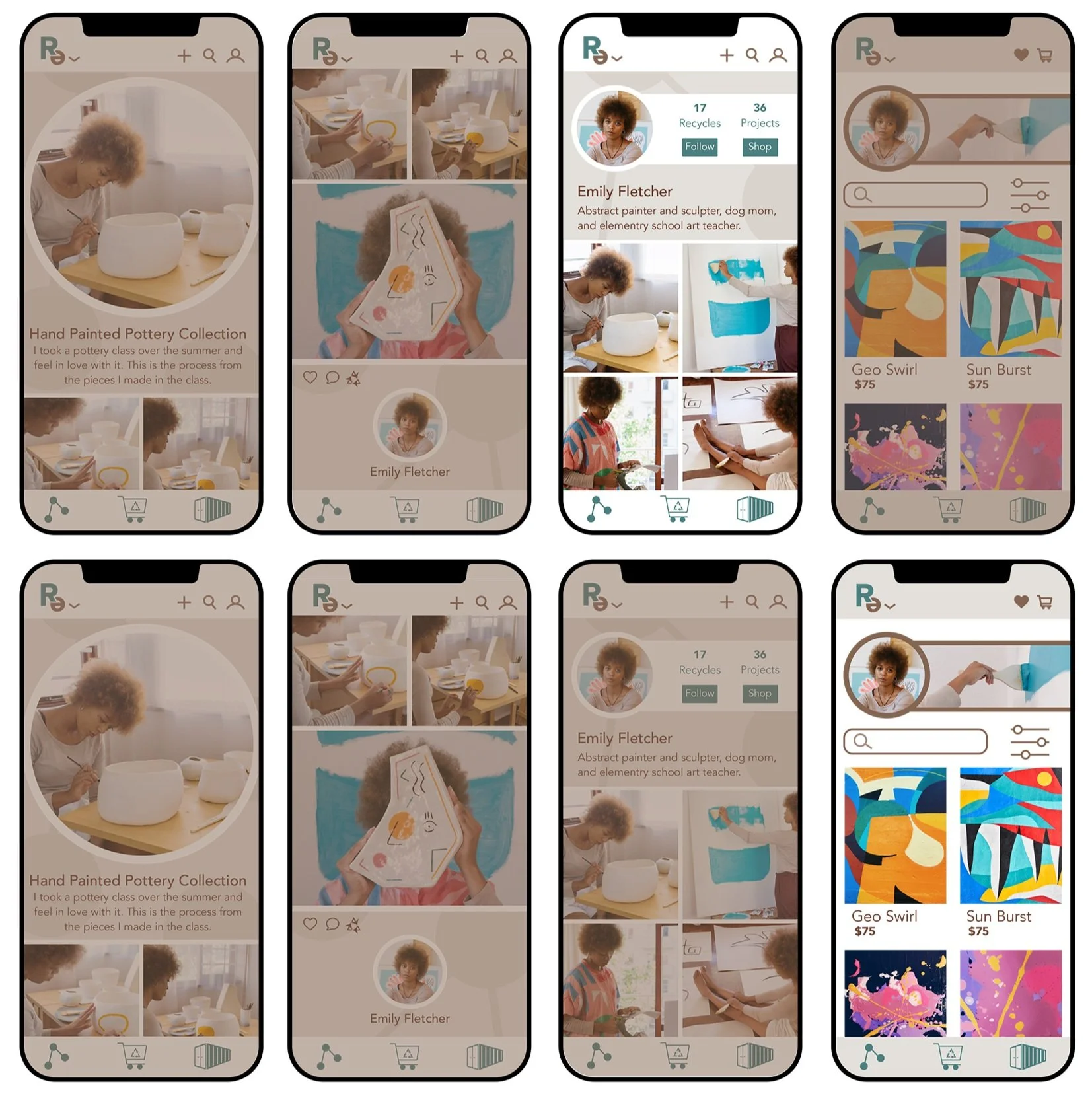
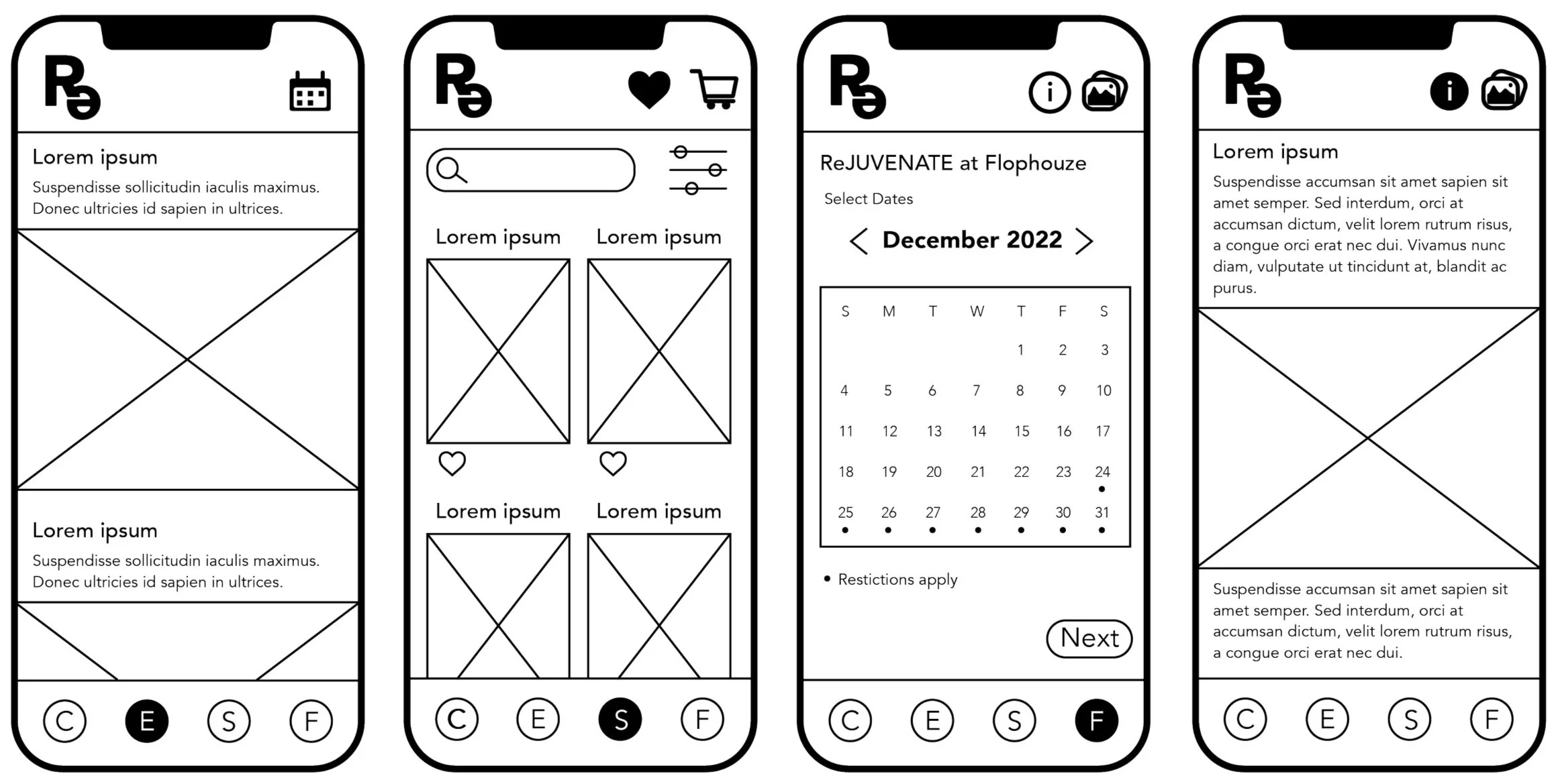
If I user has decided to click on the person who made the post, they are then taken to that persons profile. The profile will show the users photo, # of their posts that have been recycled, total # of the projects/posts they have been made, an option to follow, and a link to their shop.
This last image is an example of a users shop, which includes filters and a search field.
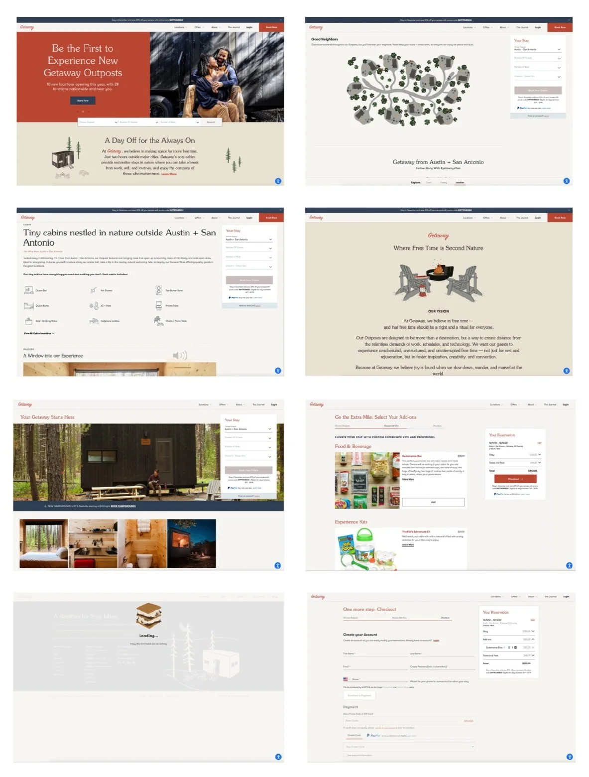
Final App Design: Flophouze
Another section of the app that I felt still had importance was the Flophouze section. When a user clicks the shipping container icon in the bottom menu, they will be brought to the Flophouze about page.
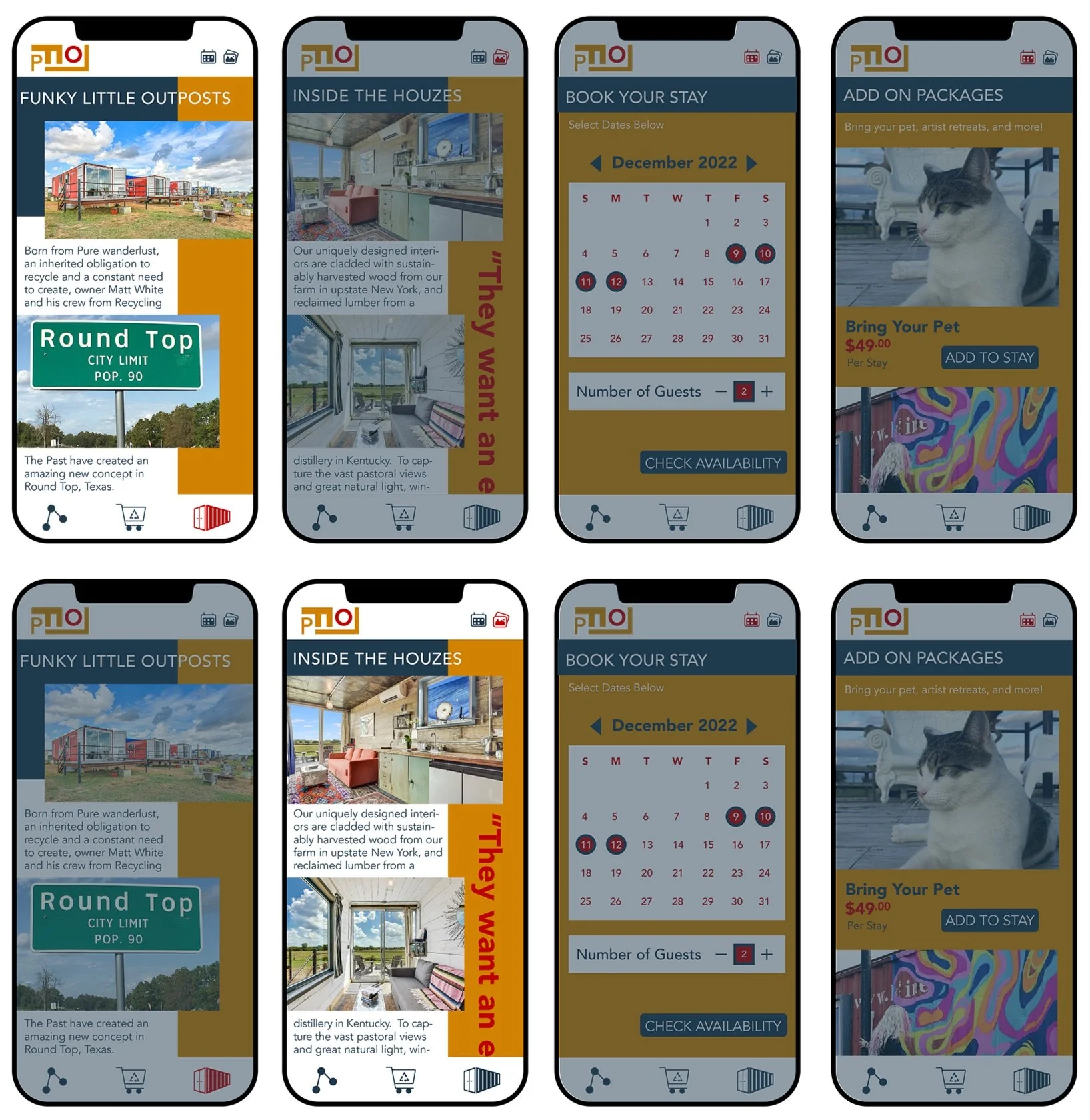
From the Flophouze about page, there is a menu in the upper right with icon that the user to click that will take them to the photo gallery next, and an icon to go to the booking page.
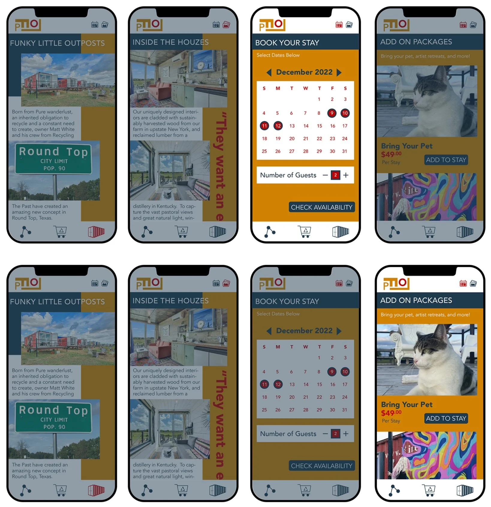
When a user clicks on the calendar icon in the upper right, they will be brought to the booking section of the app. First, they will select the dates that they would like to stay at Flophouze, as well as how many guests there will be.
Next, the user is brought to the add on packages page. Add on packages include bringing your pet, artists retreats, and having your shipping container pre-stocked with groceries.
Collaterals